Heuristics Analysis of YouTube App

Introduction
An effective method for assessing and enhancing the user experience of apps and websites is heuristic analysis. We can find problems with navigation, consistency, visibility, and other aspects that impact intuitiveness and ease of use by using well-established usability principles and heuristics. This article examines instances of performing heuristic assessments on well-known video sharing and social media platform YouTube, to show how usability issues can be identified and fixed to significantly increase user happiness.
1. Visibility of system status

Problem: - The loading screen only displays a spinning icon when a video is being started. Thus, the users are unsure of how long it will take to finish.

Proposal: - The user can know how much of the page is loaded by showing the percentage in numbers inside spinning icon. In such case, users can identify network problems if it is stuck at a specific percentage.
2. Match between system and real world

Problem: - The playing speed symbol and the term “Quality” for the video are two examples of how the app’s language doesn’t necessarily correspond with terms used in real-world video production.

Proposal: - Use the term “Resolution” instead of “Quality”. Replace the playback speed icon with the fast forward symbol or the speedometer symbol.
3. User control and freedom

Problem: - Because users are accustomed to watching short videos on Instagram or TikTok, they frequently check the captions or comments if a creator includes any link. However, with YouTube shorts, the description option is located in the top right corner, in the three dots icon. If the creator includes a link in the description, users may mistakenly confuse it for the caption or comments.

Proposal: - 1) Slide the three-dot icon beneath the comments icon and embed the share button within it to save space.
4. Consistency and standards
Problem: - As mentioned in “User control and freedom” the layouts and designs are inconsistent across different parts of the app.
Proposal: - Standardize icons, menus, and UI elements for a more consistent experience.
5. Error Prevention
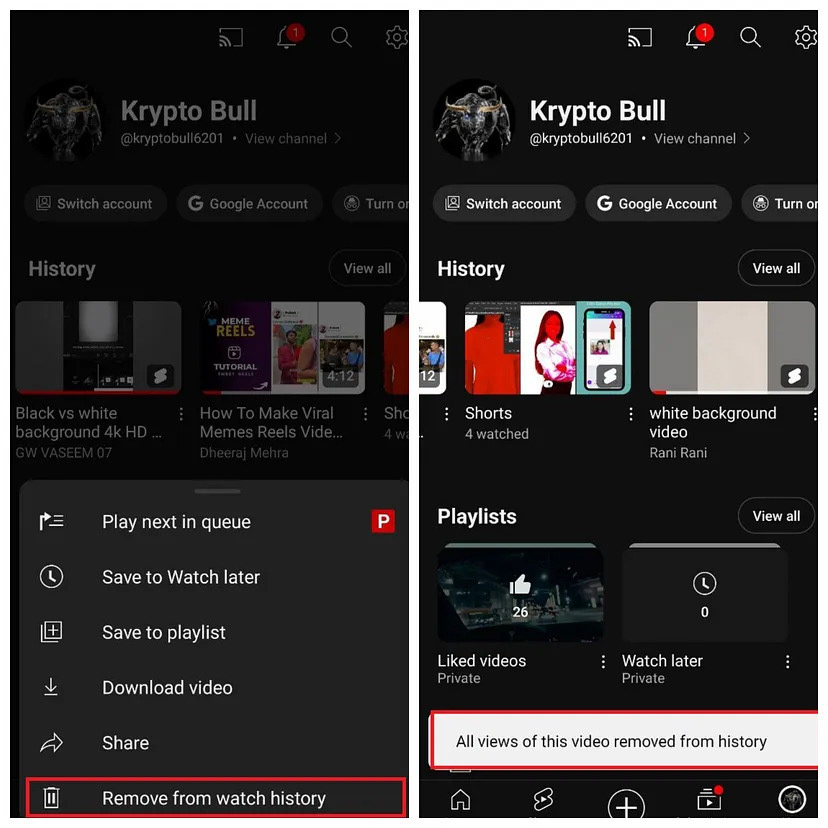
Problem: - Videos from the watch history can be deleted if you accidently select the “Remove from watch history” button.

Proposal: - Require confirmation before deleting videos.
6. Recognition rather than recall
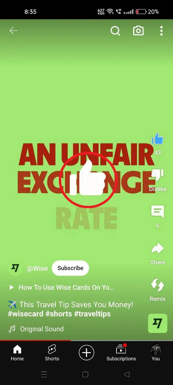
Problem: - There is no intro if you are using Shorts for the first time.
Proposal: - Give a small intro for the first-time users, like double-tap to like the post, where to check the description and what remix is.
7. Flexibility and efficiency of use
Problem: - It is not possible to review some interactions, such as the videos we disliked and the comments we left on videos. The users have to use the web version of YouTube to go through all of the detailed settings.
Proposal: - Create a “Interactions” button in the profile area and include Like, Dislike, and Comment options within it. This will make it simpler for users to see the videos they disliked and see all the comments if they left on the videos.

